How to Display Anime Figures Without Making Your Shelf Look Cluttered
A great anime figure display is not just about owning good pieces. It is about letting each figure read clearly from a normal viewing distance. When a shelf feels crowded, the problem is usually not the collection itself. It is the layout. Figures overlap, similar colors blur together, bases consume too much surface area, and premium pieces stop looking premium because nothing has room to breathe.
If you are trying to figure out how to display anime figures without making your shelf look cluttered, the smartest fix is usually not buying more storage right away. It is learning how to control spacing, height, grouping, and visual rhythm so the shelf feels intentional instead of packed.
Why Anime Figure Displays Start to Look Cluttered
Most cluttered shelves fail in the same few ways. They are not necessarily overfilled in a literal sense. They are overfilled visually.
Common causes include:
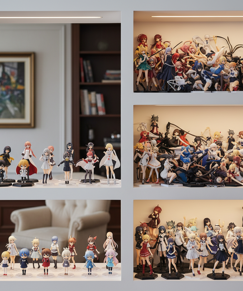
- figures placed shoulder-to-shoulder with almost no negative space
- wide hair, weapons, wings, or effect parts crossing into the next silhouette
- too many large bases on one shelf level
- poor height planning that hides shorter figures behind taller ones
- random mixing of scales with no visual hierarchy
- similar colors grouped so tightly that everything blends together
- too many “hero” pieces competing for the same focal point
Collectors often think every empty inch should be used. In reality, negative space is what gives a display structure. A shelf with a little breathing room usually looks more expensive, more curated, and easier to enjoy.
The First Rule: Display Fewer Figures Per Shelf Than Feels Efficient
A shelf usually looks its best before it reaches full physical capacity. That matters most for 1/7 and 1/8 scale figures, because their visual footprint is often larger than their base footprint.
A useful mindset is this:
- estimate space by the full silhouette, not just by the base
- add room for flowing hair, sleeves, weapons, or cape movement
- step back and judge the shelf from standing distance, not from a close-up angle
If two figures technically fit but visually merge into one shape, they do not fit well.
Quick Shelf Capacity Check
Before finalizing a layout, ask:
- Can you clearly see every face?
- Can you read each figure’s silhouette at a glance?
- Are any props or hair sections touching the next piece visually?
- Does one oversized base make the rest feel cramped?
- Does the shelf still look organized from across the room?
If the answer is “no” to two or more, the shelf is probably too crowded.
Spacing by Scale and Pose Type
One of the most useful anime figure shelf ideas is to stop spacing by official scale label alone. A calm standing figure and a dynamic figure with spread limbs do not consume space the same way.
Practical Spacing Guide
| Figure type | Typical visual footprint | Display advice |
|---|---|---|
| Prize figure with simple standing pose | Small to medium | Can sit closer together if heights vary |
| 1/8 scale posed figure | Medium | Leave visible side gaps so hair and hands do not overlap |
| 1/7 scale dynamic figure | Medium to large | Needs extra width and some front depth |
| 1/6 scale or large centerpiece | Large | Usually works best as a shelf anchor with fewer neighbors |
| Figures with wings, swords, effect parts | Larger than base suggests | Space by silhouette, not by base size |
| Nendoroids or chibi figures | Small | Best grouped intentionally instead of scattered between scales |
Standing Poses Can Handle Tighter Grouping
Straight upright poses usually tolerate tighter spacing because their outlines stay compact. That makes them good for lineup-style displays, especially if the heights are staggered slightly.
Dynamic Poses Need More Breathing Room
Figures with action poses, long hair arcs, or large accessories need more open space. If you place two dynamic figures side by side, the shelf often starts looking noisy fast.
Depth Should Help Visibility, Not Hide Figures
Back-row placement can work, but only if the rear figure is still readable. Without elevation, the second row usually disappears. Depth is useful only when the display still looks clear from the front.
Grouping by Series, Color, or Height
Grouping is what turns a random arrangement into a designed anime figure display. If you want the shelf to feel less cluttered without removing half the collection, grouping is one of the highest-impact fixes.
Group by Series for Instant Visual Logic
Figures from the same series often share costume shapes, colors, and proportions. That creates natural harmony even when the shelf holds several pieces.
This works especially well for:
- main cast lineups
- rival or duo pairings
- matching manufacturer lines
- school uniform or themed costume sets
A series-based shelf feels intentional because the viewer understands the connection immediately.
Group by Color to Reduce Visual Noise
If your collection spans many franchises, color grouping can work even better than series grouping. Similar tones make the shelf feel curated instead of chaotic.
Examples include:
- warm shelf: red, gold, pink, orange accents
- cool shelf: blue, white, silver, violet accents
- dark shelf: black, crimson, navy, muted gray
- soft shelf: pastel costumes and lighter hair colors
You do not need perfect matching. You just want to avoid hard color collisions that make the eye jump all over the shelf.
Group by Height to Build a Cleaner Outline
The top line of the display matters more than many collectors realize. Random height spikes make shelves feel disorderly.
Try this approach:
- place the tallest figures toward the back or outer edges
- keep medium-height figures in the main viewing zone
- elevate very short figures if they would otherwise vanish
- avoid placing a tiny piece directly beside a visually massive sculpt unless the contrast is deliberate
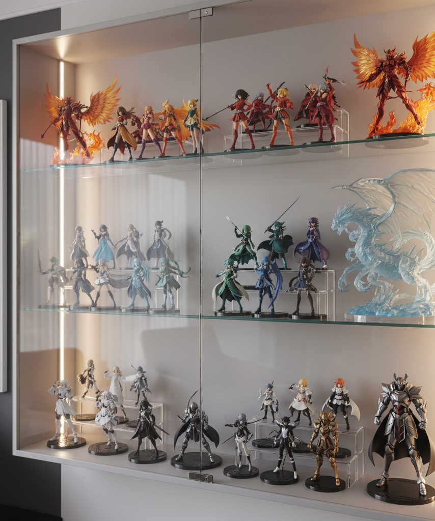
When to Use Risers, Stands, or Back-Row Elevation
Elevation tools are one of the easiest ways to improve an anime figure display. Used well, they increase readability without making the shelf feel busy.
Risers Work Best for Similar-Size Figures
Clear acrylic risers are especially useful for:
- prize figures
- compact scale figures
- Nendoroids and chibi lines
- same-series groups where the back row would otherwise disappear
They help create a second viewing layer without adding much visual weight.
Small Platforms Help Compact Figures Claim Space
Mini figures often get lost when they sit beside larger scales. A subtle stand or platform can make them readable without pretending they belong on the same physical level.
Back-Row Elevation Only Works if the Front Row Stays Low
If your front row already has tall figures, raising the rear row will not solve much. But if the front row uses seated poses, kneeling figures, or shorter pieces, a lightly elevated back row can look clean and efficient.
Keep the Support Structure Quiet
The riser itself should not become the focus. Clear acrylic usually works best because it gives height without adding visual heaviness.
Avoid:
- bulky decorative risers that compete with the figures
- too many different stand styles on one shelf
- bright support colors unless the whole shelf has a deliberate theme
Mistakes That Make Premium Figures Disappear Visually
A premium figure can look surprisingly average when the shelf around it works against it.
Mistake 1: Putting Too Many Statement Pieces Together
If every figure has a dramatic pose, oversized effect base, or high-contrast palette, the shelf loses hierarchy. The eye has nowhere to rest.
Mistake 2: Letting Bases Touch or Nearly Touch
Even when the figures themselves are beautiful, crowded bases make the whole shelf feel compressed. The base spacing often matters as much as the sculpt spacing.
Mistake 3: Mixing Tiny and Huge Pieces Randomly
A very small figure beside a large 1/6 or heavy effect piece can look accidental unless the contrast is clearly styled.
Mistake 4: Ignoring Background and Lighting
Busy wallpapers, harsh reflections, or uneven lighting can make a decent arrangement look chaotic. Soft, consistent lighting helps separate figures from the background and makes spacing feel more deliberate.
Mistake 5: Displaying Everything Straight Forward
When every figure faces the exact same direction at the exact same depth, the shelf can look flat and retail-like. A small amount of angle variation helps, but too much creates confusion. Aim for subtle differences, not dramatic randomness.
Three Reliable Shelf Layouts That Usually Work
If you want practical anime figure shelf ideas, start with one of these layouts instead of improvising endlessly.
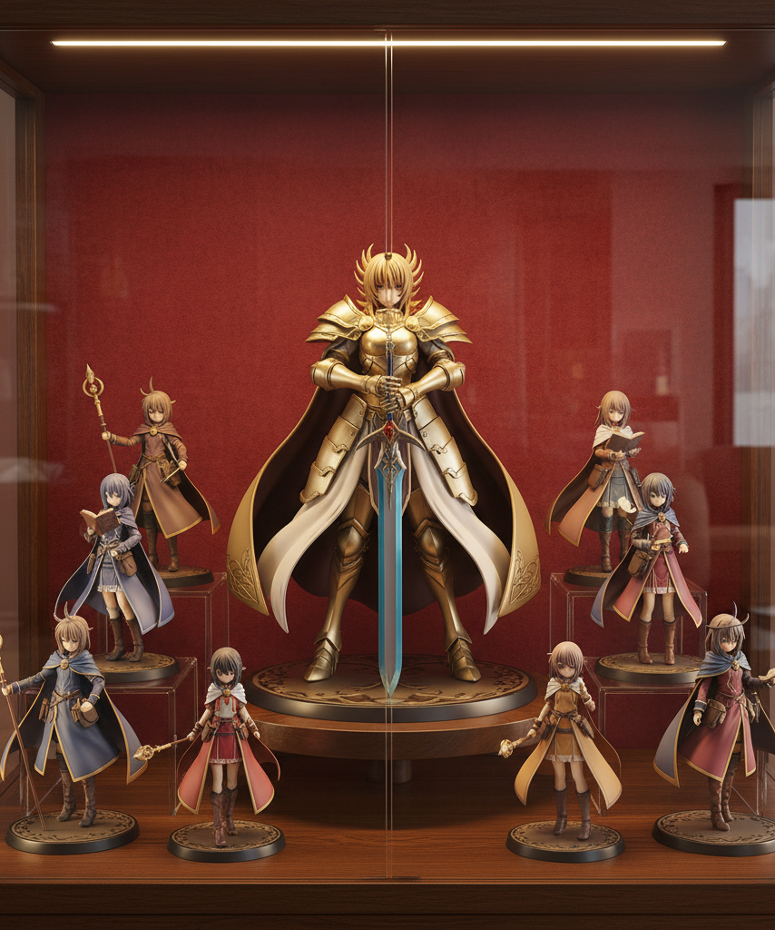
1. The Anchor-and-Support Layout
Use one dominant figure as the shelf focal point, then place one to three quieter pieces around it.
Best for:
- premium scale figures
- anniversary or deluxe releases
- dynamic centerpiece pieces
Why it works:
- the eye gets a clear focal point first
- support figures add context without competing
- the shelf feels styled instead of stuffed
2. The Balanced Trio
Place three figures with clear spacing and mild height variation.
Best for:
- 1/7 scale displays
- character trios
- visually related figures from one line
Why it works:
- odd-number grouping usually feels more natural
- it avoids the “stocked shelf” look
- each silhouette stays readable
3. The Tiered Back Row
Use risers to create a visible second line.
Best for:
- prize figure groups
- Nendoroids
- collections with many smaller pieces
Why it works:
- it uses depth without hiding figures
- it increases capacity while keeping the shelf readable
- it adds structure to otherwise flat shelf levels
Final Answer: How to Display Anime Figures Without Clutter
If you want to know how to display anime figures without making your shelf look cluttered, focus on readability before capacity. Leave more open space than feels efficient, group figures by series, color, or height, give dynamic poses more room than standing poses, and use risers only when they improve visibility instead of adding noise.
The best anime figure display does not show the maximum number of figures possible. It shows the right number of figures in a way that lets each one stand out. When every piece can be seen clearly, the shelf stops looking crowded and starts looking curated.
Best Display Cases for Anime Figures: How to Choose for Dust, Space, and Style – VaultFigure
[…] How to Display Anime Figures Without Making Your Shelf Look Cluttered […]
Anime Figure Shelf Spacing Guide: How Much Room Do You Really Need? – VaultFigure
[…] If your main goal is better visual balance after everything fits, this display layout guide pairs well with spacing planning: How to Display Anime Figures Without Making Your Shelf Look Cluttered. […]