How to Tell if Two Anime Figures Will Look Right Together on the Same Shelf
Buying two figures you love separately does not guarantee they will look good together once they finally meet on the same shelf. One can read as elegant while the other feels loud, one base can swallow the scene, or a supposed scale match can still look awkward because the poses and visual weight fight each other.
That is why anime figure display compatibility matters before checkout, not after delivery. If you want a reliable anime figure scale comparison process, you need to judge more than the printed scale ratio. You also need to look at silhouette, base footprint, color temperature, franchise style, and how each figure uses space around it. This guide breaks down how collectors can tell whether two anime figures will actually look right together on the same shelf.
Why Figures That Look Fine Alone Can Clash on a Shelf
A figure can be excellent on its own and still be a poor partner for another piece. Shelf harmony comes from relationships, not isolated quality. When two figures share one display zone, your eye compares them instantly.
Common clash points include:
- one figure reading much taller because of hair, weapons, or an effect piece
- a wide decorative base making the second figure look cramped
- one paint scheme feeling soft and pastel while the other is dark and high-contrast
- one sculpt being calm and museum-like while the other is explosive and action-heavy
- different line styles making characters look like they belong to separate visual worlds
This is why collectors who only check anime figure scales often miss the real problem. Scale tells you the manufacturer’s intent. Display harmony tells you what your shelf will actually show.
Start With Scale, but Do Not Stop There
The fastest first check is still the listed scale. If one figure is 1/7 and the other is 1/4, you already know the pairing will be difficult unless the larger piece is intentionally meant to dominate the shelf. But anime figure scale comparison is more nuanced than matching numbers.
A useful starting rule:
- 1/8 with 1/7 can work when poses and bases are restrained
- 1/7 with 1/6 can work when the smaller figure has strong vertical presence
- prize figures can mix with scales only if the sculpt style and visual mass feel close
- 1/4 scale usually wants its own space unless paired in a deliberate featured layout
Why Same Scale Does Not Always Look the Same
Two figures both labeled 1/7 can still look noticeably different in person. Character height, crouching versus standing poses, oversized costumes, and hair volume all change perceived size. A seated figure may technically match scale but still look tiny next to a standing figure with a cape and raised arm.
For that reason, do not ask only, “Are these the same scale?” Ask:
- what is the actual height in centimeters
- how much width does the silhouette occupy
- how much height comes from effects, hats, hair, or weapons
- does one pose compress the body while the other stretches it vertically
That turns a basic anime figure scale guide into a practical shelf-planning check.
Check the Base Footprint Before You Buy
Collectors often underestimate how much a base changes compatibility. Two figures can have a perfect size relationship and still fail because one base is oversized, visually busy, or shaped in a way that blocks comfortable spacing.
Before pairing two figures on the same shelf, compare:
- base diameter or width
- base shape, such as circle, oval, rectangle, terrain scene, or effect burst
- how far the sculpt extends beyond the base edge
- whether any hair strands, weapons, or clothing tails overhang into shared space
A clean figure on a small transparent base can coexist with many neighbors. A figure on a dramatic scene base behaves more like a mini diorama and often demands breathing room on all sides.
The Best Way to Judge Real Shelf Use
Think in rectangles, not just product photos. Even if the base is round, the figure often occupies a larger invisible box once you include extended limbs and visual spacing. If both figures need a generous invisible box, they may technically fit but still look crowded.
A quick mental layout is:
- left figure footprint
- gap for breathing room
- right figure footprint
- extra clearance for overhang and dusting access
If that layout already feels tight in your head, it will usually look tighter on the actual shelf.
Compare Pose Energy and Direction
Pose balance matters as much as size. Two static standing figures often create a calm, curated display. Two aggressive action poses can also work together if they share similar energy. Problems start when one figure is visually shouting while the other is whispering.
Look at pose direction:
- are both figures facing forward, inward, or away from each other
- does one weapon, wing, or effect line point directly into the other figure’s space
- do both figures lean in a way that makes the shelf feel lopsided
- is one pose so dynamic that it steals attention no matter what stands beside it
Pairing Rules That Usually Work
These combinations tend to feel balanced:
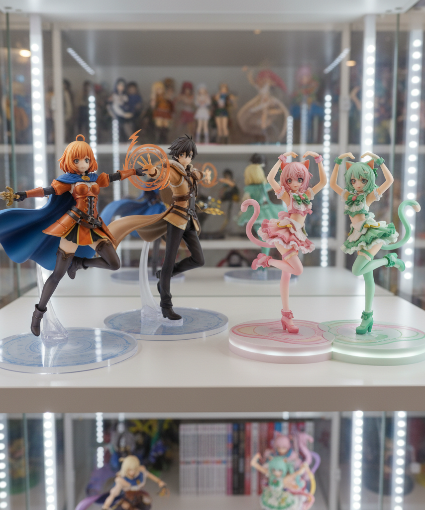
- two calm poses with similar posture and eye line
- one action pose paired with one quieter figure that acts as a visual anchor
- mirrored or slightly inward-facing poses that make the pair feel connected
- two seated or low-center-of-gravity figures with similar mass distribution
These combinations often fail:
- one museum-pose figure beside a huge explosion-effect sculpt
- two figures both leaning outward, making the arrangement feel like it is splitting apart
- a delicate character buried next to a heavily armored, high-contrast sculpt
- two large-motion poses whose effect parts overlap visually even when they do not physically touch
Watch for Color Clash, Not Just Color Difference
Collectors sometimes think matching means same colors. It does not. Color harmony is more about whether the palette conversation feels intentional.
Two figures can work well together if:
- they share similar saturation levels
- both use warm or cool dominant tones
- accent colors repeat in a controlled way
- one figure’s palette helps frame the other instead of fighting it
Two figures can clash if:
- one uses soft matte pastels and the other uses extreme neon contrast
- skin tone rendering and paint finish feel noticeably different
- one figure is visually bright in every area with no resting point
- both figures compete with equally loud reds, blues, or effect-piece translucency
A good same shelf pairing usually has one of three relationships: echo, contrast, or hierarchy. Echo means the colors feel naturally related. Contrast means they are different but still look designed together. Hierarchy means one figure is clearly the star and the second supports it.
Line Compatibility Matters More Than Many Buyers Expect
Some pairings fail because the design languages are too far apart. An ultra-glossy modern sculpt with intense shading can look strange beside a softer, older-style figure with simple paint transitions. Even when the franchises are different, the line quality still needs some common ground.
Check for compatibility in:
- face style and eye rendering
- hair sculpt sharpness versus softness
- amount of texture and costume detail
- finish style, such as glossy, satin, or muted matte
- overall era or brand feel of the sculpt
This does not mean you can never mix franchises or manufacturers. Mixed collections can look great. But the further apart the art direction is, the more careful you need to be with spacing and composition.
Decide Whether the Shelf Is Telling One Story or Hosting a Mix
A pair looks more natural when you know the display goal. Are these two figures supposed to feel like a matched set, a themed duo, or simply two favorites sharing real estate?
If you want a matched-set feel, prioritize:
- same franchise or closely related visual tone
- similar scale band
- similar base restraint
- equal attention weight
If you want a mixed-collection shelf, prioritize:
- one dominant visual anchor
- clear spacing between unlike styles
- repeated shelf elements, such as risers or lighting, to unify the scene
- color balance across the whole shelf, not just the two figures alone
Collectors often force a false duo when what they really have is a mixed shelf. Once you accept that, the display becomes easier to solve because the goal changes from “make them twins” to “make them coexist cleanly.”
A Quick Compatibility Checklist for Mixed Collections
Before buying the second figure, run through this shortlist:
- Are the listed scales close enough for the display goal?
- Do the actual heights in centimeters still look compatible?
- Will the base footprints leave real breathing room?
- Do the poses complement each other or compete for space?
- Do the colors create harmony, contrast, or useful hierarchy?
- Does one figure completely dominate the other by mass, effects, or finish?
- Do both pieces look like they belong in the same display mood?
- Will the shelf still be easy to clean and maintain once both are placed?
If you hesitate on three or more of those checks, the pair probably needs more distance or a different shelf plan.
Simple Pairing Examples Collectors Can Use
Pairing That Usually Works
A 1/7 scale standing character with a compact circular base next to another 1/7 or restrained 1/8 figure with similar finish quality usually works well. Even if the franchises differ, the display can still feel intentional when both pieces have calm poses and comparable visual weight.
Pairing That Needs Caution
A prize figure next to a premium 1/6 or elaborate 1/7 statue-style piece can work, but only if the cheaper figure is not swallowed by differences in paint depth, base complexity, and sculpt sharpness. This is where anime figure display compatibility becomes less about category names and more about what the eye reads first.
Pairing That Often Fails
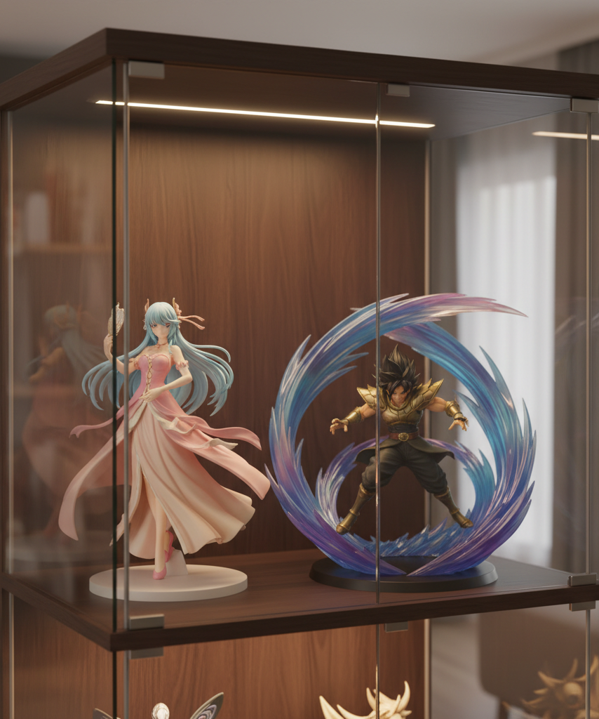
A seated, soft-colored figure with a tiny transparent base beside a tall combat pose with huge translucent effects usually feels mismatched on the same shelf unless you intentionally stage one as a background support piece.
Final Thoughts
If you want to know how to tell if two anime figures will look right together on the same shelf, start with scale, then move immediately to footprint, pose, palette, and line style. The best pairings are not always the most similar figures. They are the figures that make each other easier to read.
A smart anime figure scale comparison should answer two questions at once: can these figures physically share the space, and will they create display harmony once they do? If the answer to the first question is yes but the second is uncertain, keep looking. Shelf compatibility is what turns two good purchases into one display that actually feels finished.